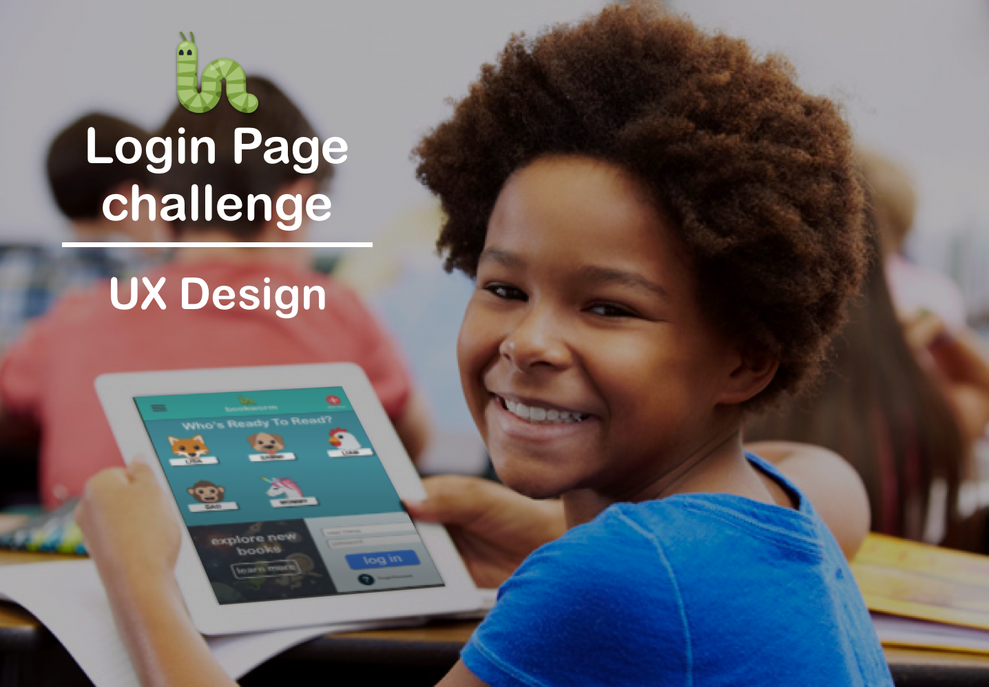
Bookworm
Login page design for a children's reading app
Duration: 2 working days
Overview
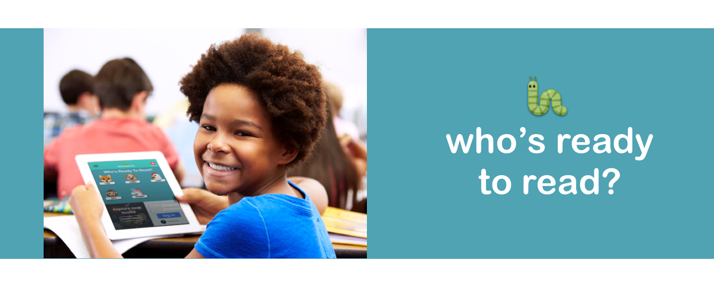
Bookworm is a storybook application for children aged 3-10. This application will be available for individual usage (B2C) as well as from school usage (B2B). Children use this application for storybook reading while their parents and teachers also use this application to review children’s usage. So, primary users of this application are children aged 3-10, parents and schools (teachers). All three primary users are expected to use this application very frequently. Majority of the parents and children will use the application via a common shared device.
Challenge
Design a login page for the above mentioned usages.
List the potential scenarios to be considered in designing the page.
- Suggest the approaches that might eliminate the need for a login page on every access of the application. (see closing)
Understanding the User
Possible Scenarios
- A child is returning to read their book*
- A child is reading with parent
- A child is new to app
- A child is reading on a "public" device*
- Parent is checking progress
- Parent is first time user
- Parent is adding a user
*This proved to be a major point of inflection and should be explored more in depth in future iterations.
What to focus on
Even though the challenge was to build a small portion of the users journey, I believe it is important to take a step back to understand the whole situation. That is why it was important to put the screen in question in context with the a user flow.
To chart this, even though there were multiple difference possible scenarios of use, I decided to focus on the child returning to read their book on a family device. From this starting point I could develop a user flow and ultimatly a design that is speceific to them.
Creating a user Flow
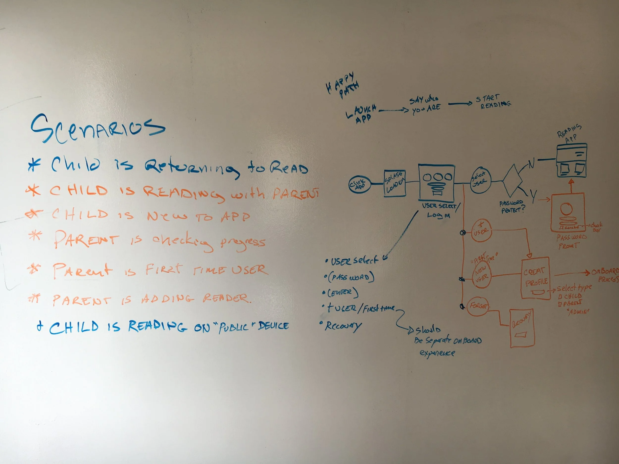
Early whiteboard work to layout the user flow and potential and primary scenarios the user might take.
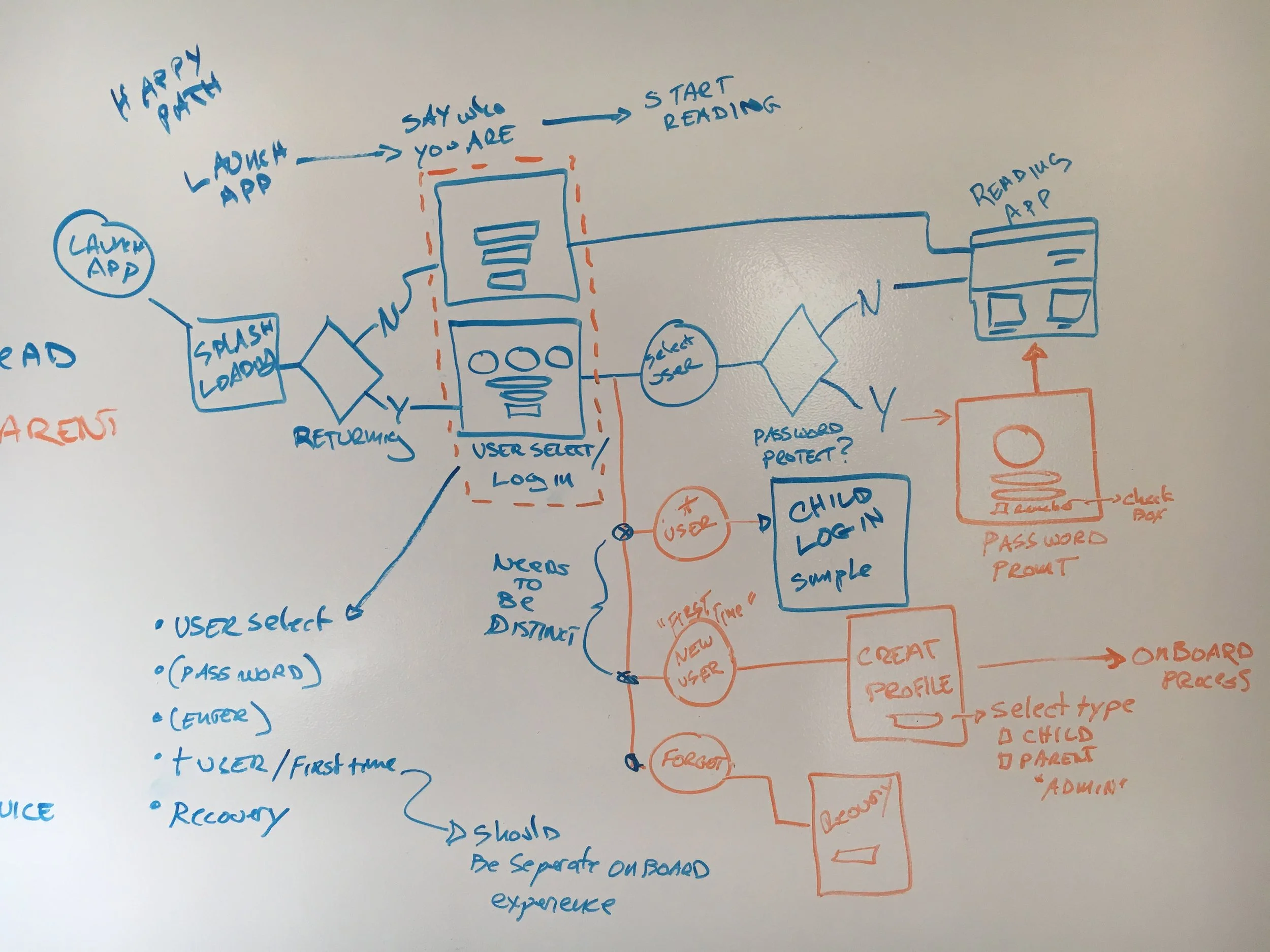
Further developed user flow to incorporate more scenerios
Research
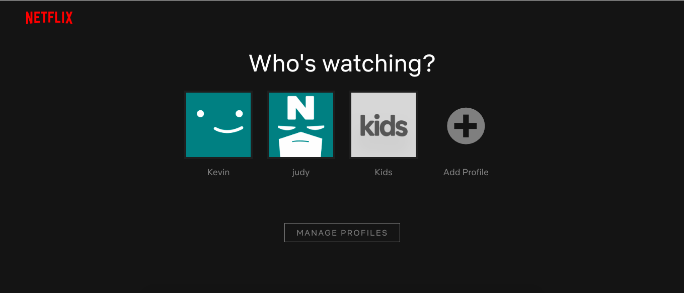
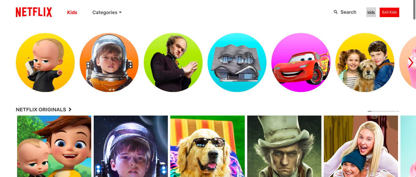
For research I looked at both direct competitors and other applications that I thought could be drawn on for inspiration. Specifically how apps handle multiple users on one device. For this instance I think Netflix does an excellent job of this.
Competitive Analysis
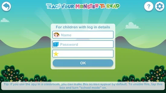
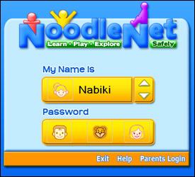
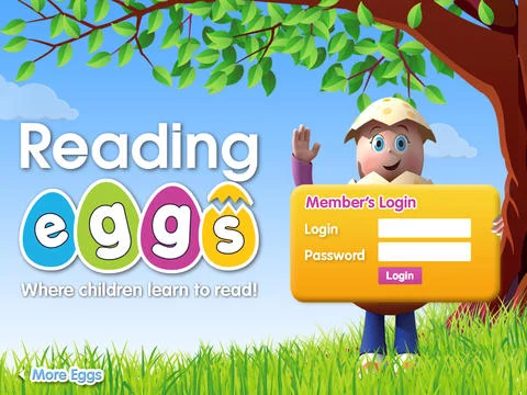
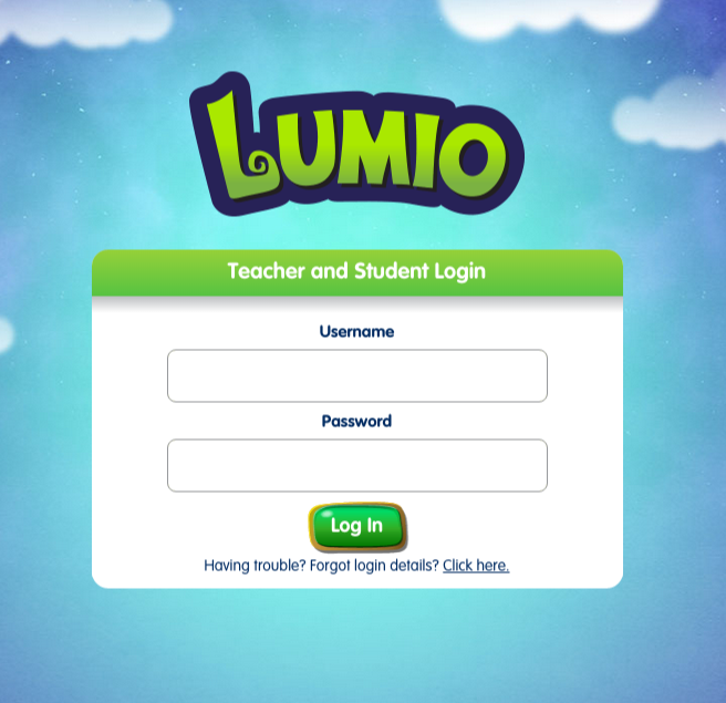
Comparative Analysis

Design
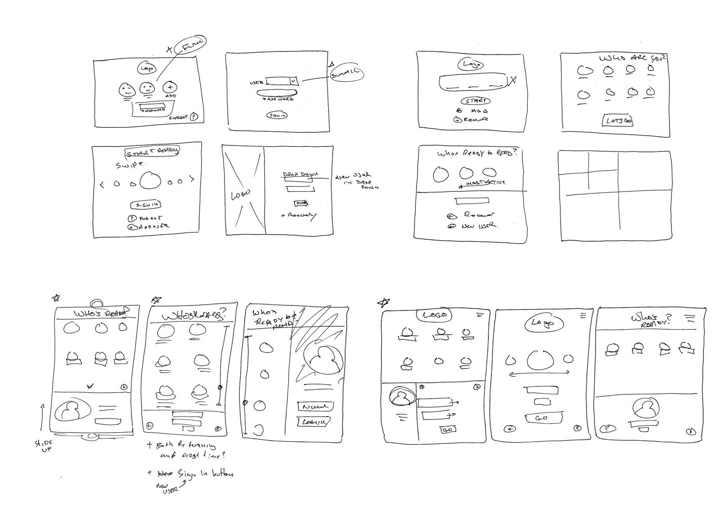
Rapid Ideation Sketches
A technique I used to brainstorm content ideas was inspired by a “Crazy 8” exercise. It is a fantastic technique to ideate quickly to and generate divergent thinking on one topic. Given one minute each, I sketched out as many variant design options for the log in page. By focusing on the rapid ideation, I was able to come up with unique jumping off points for the final design.
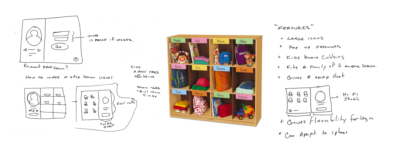
Insight
How to make a menu visually appealing and relatable to children ages 3- 10? I asked myself if I could reinvent the drop down menu, or how to make it more visual. I came up with the idea to lay out icons in a grid format with user names under them because that is how I first remembered how to identify as things being "mine". Cubbies, bins, or coat hooks with names are all ways teachers and parents personalize things for children to help keep organized. This is the idea I grabbed onto when thinking about how to present a list of users.
Final round of sketches
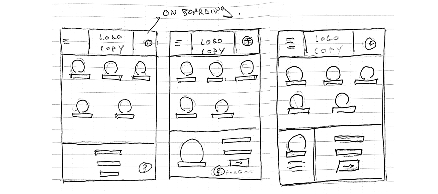
Medium Fidelity Wireframes
From pen and paper sketches, I then developed medium Fidelity wireframes within the Sketch App to get a sense of exact space and I could start to add some more substantial content. At this point I had still not landed on a final layout so some screens are alternate versions.
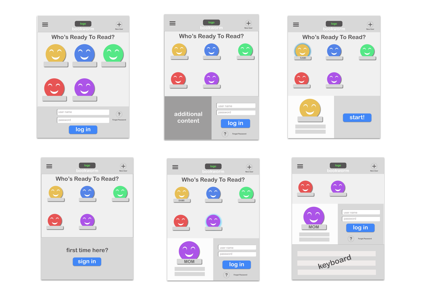
Visual Design
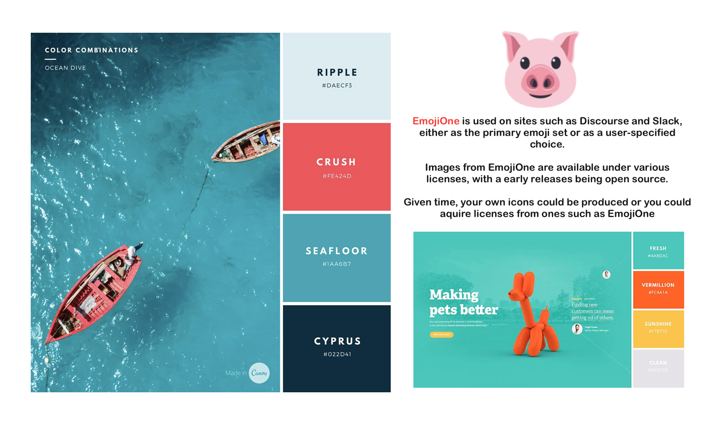
A very light UI was developed using bright neutral colors and playful iconography
High Fidelity Mock Ups
When I was ready to move onto Hi Fidelity Mockups, I brought in more permanent design elements and started to give the content specific context.
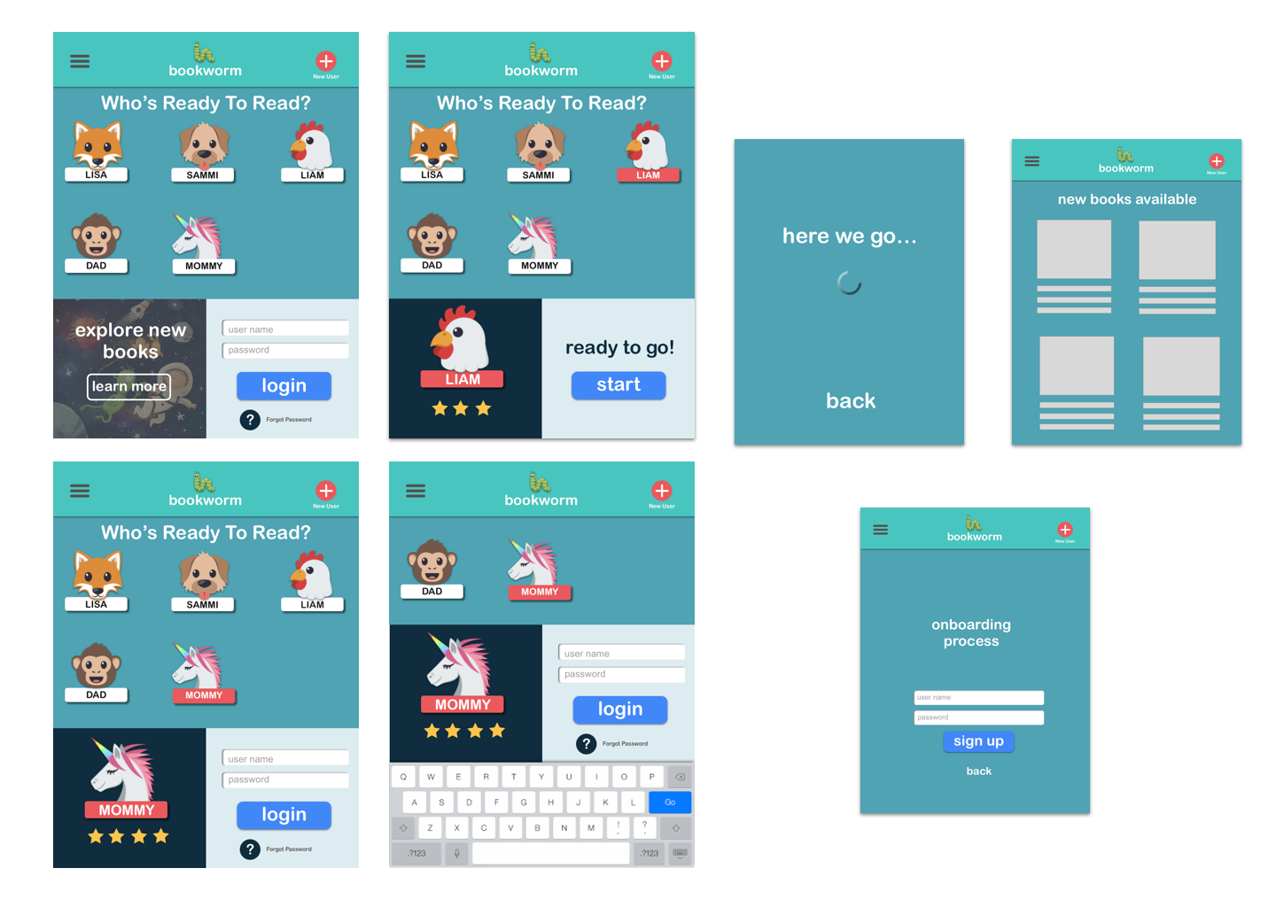
Hi Fi Prototype
Using Invision I was able to develop a prototype
Click Launch to interact
click Liam to log in right away.
Click Mommy to enter your user name and password
Closing
Suggestions:
After going though this design challenge and having time to think of the different users and the different possible scenarios here are some suggestions to eliminate a sign in on every app launch:
- A system that auto remembers login information and save your profile (much like the icons)
- Addition of a "remember me" checkbox on login, or similarly A pop up after the user logs in.
- Do Children even need to remember passwords? Have parental controls that do not require children to need passwords.
- This is a new IOS feature but just to put it out there, if you could utilize facial recognition to login.
Takeaways:
With all the suggestions and design work above, it became clear that one thing needs to be addressed when going forward. How many users will be using a single device? In a school environment, will hundreds of children be sharing devices? This will affect how we can move forward with the above suggestions and further design solutions.
Further:
Given more time to work on this challenge, I would have done some actual usability testing after developing the wireframes or even some initial feedback using pencil sketches.