
*this project was done as part of course work and was not at the request of Hello Vera
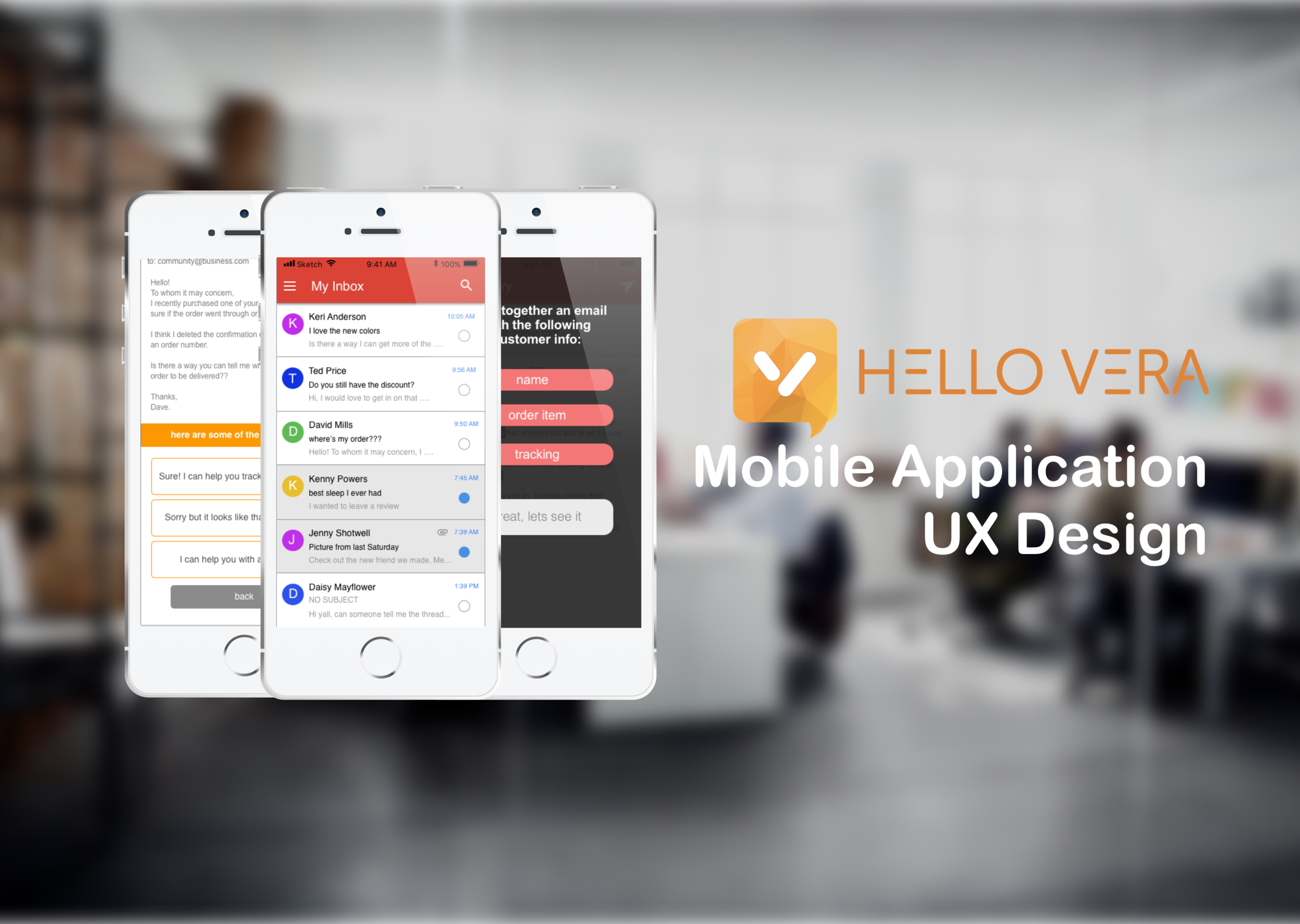
Project Overview
Deliverables
User Research, Ideation, User Testing, Wireframes, User Flow, Low to High Fi prototypes.
Constraints
Over a period of 10 weeks, the project spanned the entire UX process from user research to prototype.
tools
Pen and paper, Sketch, InVision, Marvel.
Problem
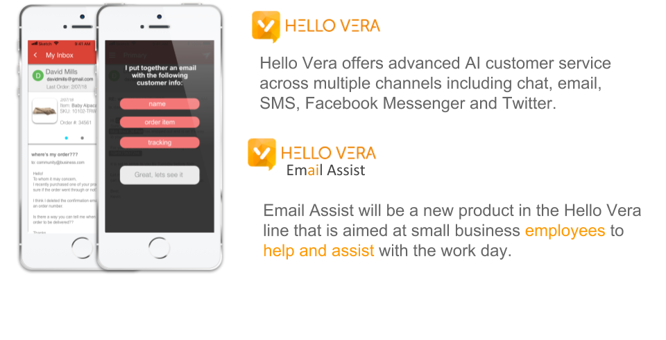
Employees of small to mid size companies need a way to effectively deal with routine and redundant emails because their current method is too time consuming and hampers their contributions in more needed areas of the company.
Solution
I believe that by creating an application that can automate most of the mundane tasks related to email response for employees of small to mid range companies, it will help provide a more effective and efficient response method.
User Discovery and Research
Goals
To learn about the process and pitfalls of working an email / communication intensive job.
Research process
In person interviews were conducted with individuals who interact with email on a daily basis. Questions were formatted as open ended to allow subjects to put their processes and frustrations in their own words.
Audience
Company employees that need to communicate with their customers on a personal level.
Employees of small to mid range companies that are one of the first touch points and responders of the “@community” box.
Competitive Analysis
For the competitive analysis I looked at some of the current options that are available to employees who have to sort through large amounts of emails. Based on first hand use and research, I made some rough groupings of features to find common trends as well as opportunities for features and solutions to our users problem.
User Interviews
Over the course of 2 weeks, 8 interviews were conducted either in person or over the phone. Each interviewee was asked the same open ended questions but was given room to respond or elaborate on a subject.
4. What kinds of tasks usually take the longest and are the most time intensive on your end when communicating with customers?
5. What do you think the biggest friction point is in this process?
6. What would the ideal process for you look like?
1. Tell me about your work process in terms email correspondence. How do people get in touch with you and how do you respond?
2. Tell me about the last notable and / or most common, one on one communication you had with a customer or client?
3. What are the tools that help you out with this process?
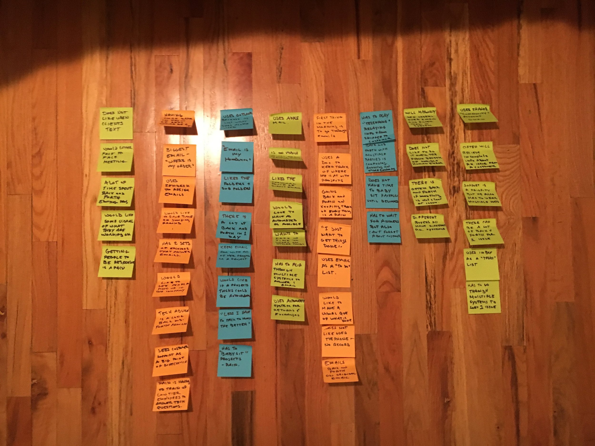
Empathy Mapping
By mapping out user responses I was able to group common needs, wants, or frustrations in order to see what are areas that stand out. From common groups we can draw out user insights that can inform design decisions later in the process.
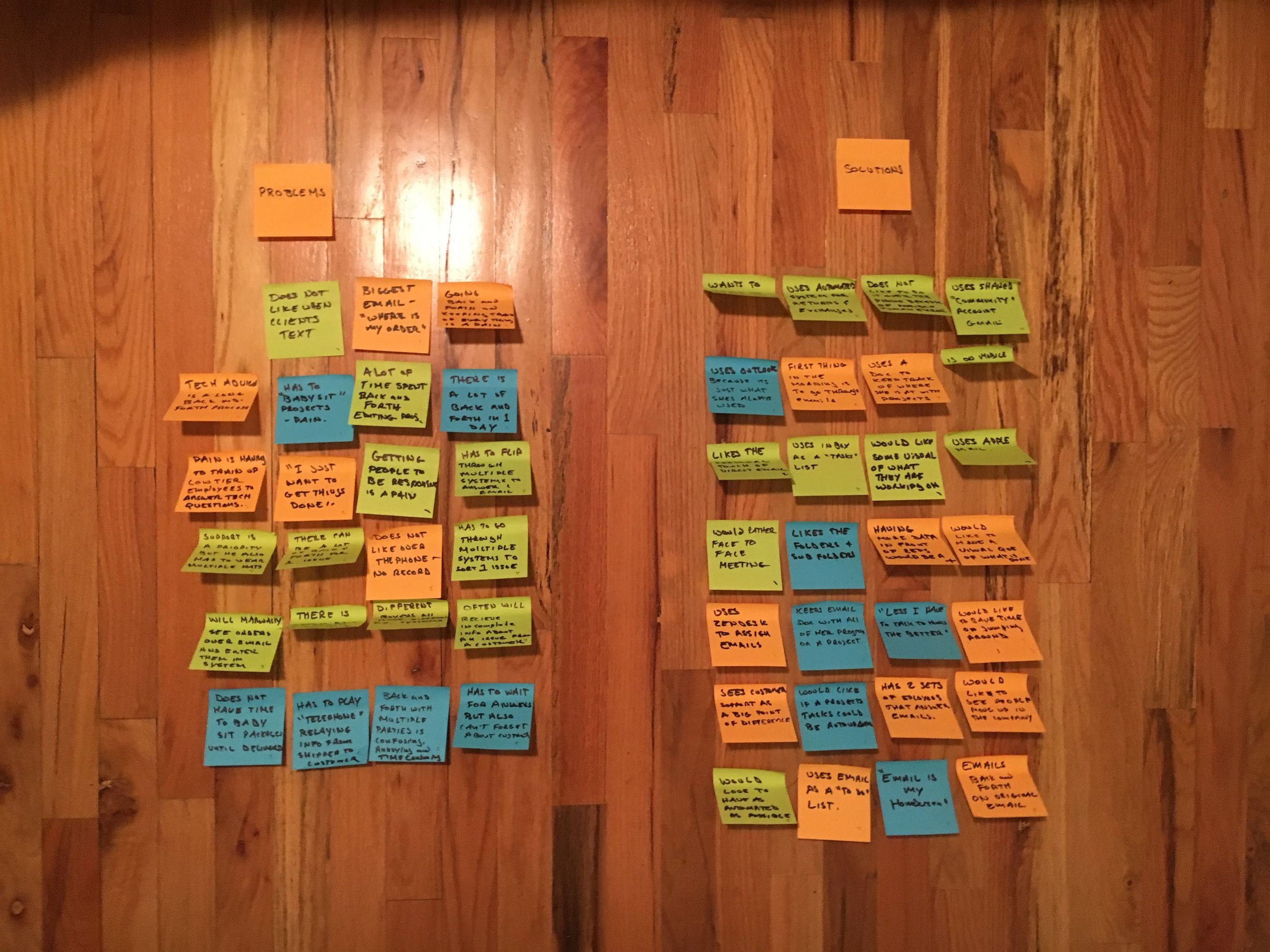
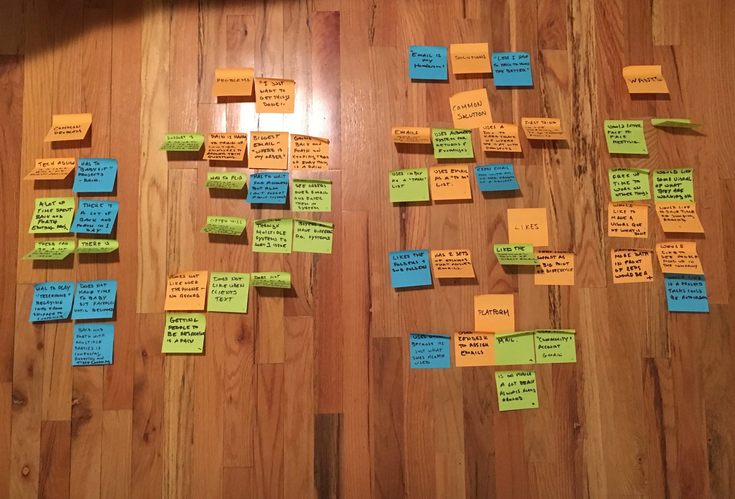
User INsights
Common Problems
Mention the constant "back and forth" and "babysitting" emails.
Easy to lose track of work flow with no reminders.
Lack of info that results in having to manually gather missing info through multiple tabs or systems.
Training up lower tier employees to answer questions is costly and time consuming.
User Made Solutions
Often use email as their homepage
Email is where a lot of people manage their day to day tasks.
People will also use notepads, word docs and other tools to keep track of project progress.
Wants
More data for employees
tasks update automation
Free up time for employees to work on bigger projects
Save time jumping around apps and programs.
Something that is more natural like a "face to face"
As automated as possible.
Likes
Sees customer service as a big point of differentiation that their company can offer.
Likes the personal touch of human response.
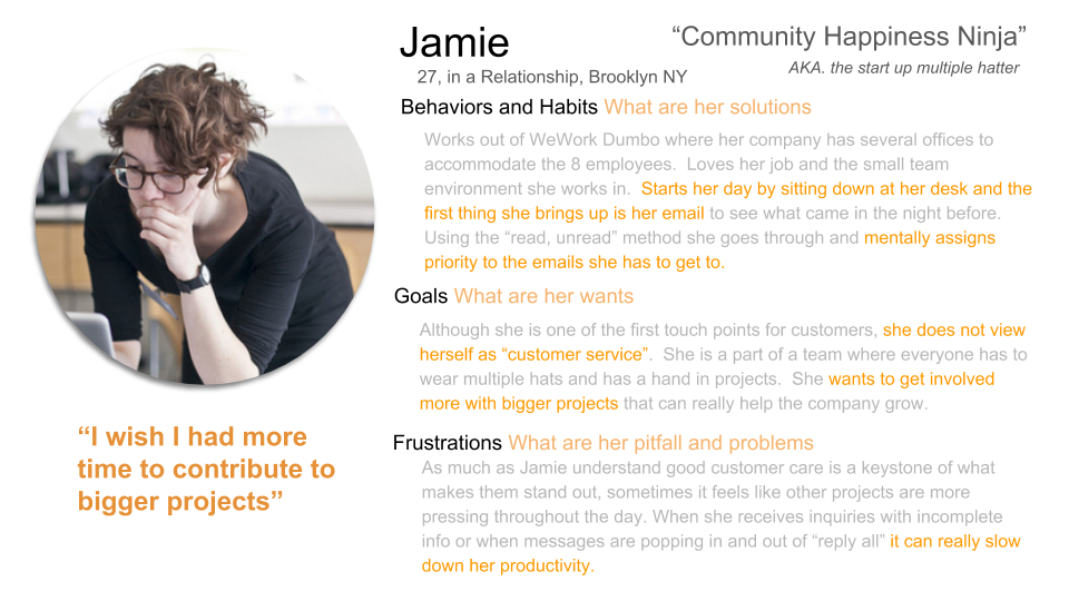
User Persona
Solution Building
Defining the Core Experience
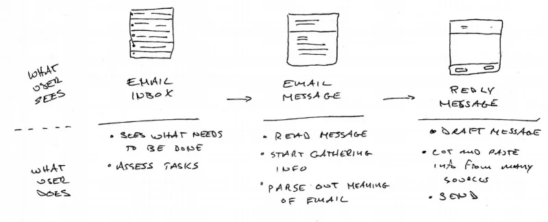
By listening to user feedback and giving them the opportunity to “tell me about your day” I was able to strip down the core experience of the user into “buckets” for which I could focus on making improvements. What became clear is that within the existing experience there were three points to attack the problem.
This became the anchor for what I could design and build screens and apply features. With these three main actions defined, I could more easily map out features that would assist the user. Moving forward, I could ask myself "Does this solution or feature align with one of these three actions?".
Feature Ideation
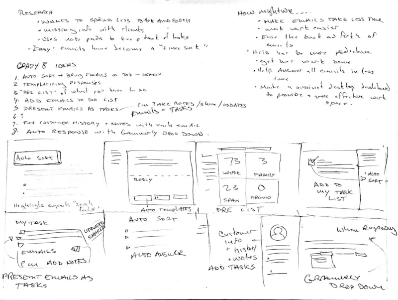
A technique I used to brainstorm content ideas was inspired by a “Crazy 8” exercise. It is a fantastic technique to ideate quickly to and generate divergent thinking on one topic.
The idea is to generate as many ideas as possible within a short timeframe, focusing on quantity of ideas not quality, forcing you to quickly think outside the box.
By focusing on the rapid ideation and ignoring constraints of viability, I was able to come up with unique jumping off points for features.
Feature Prioritization
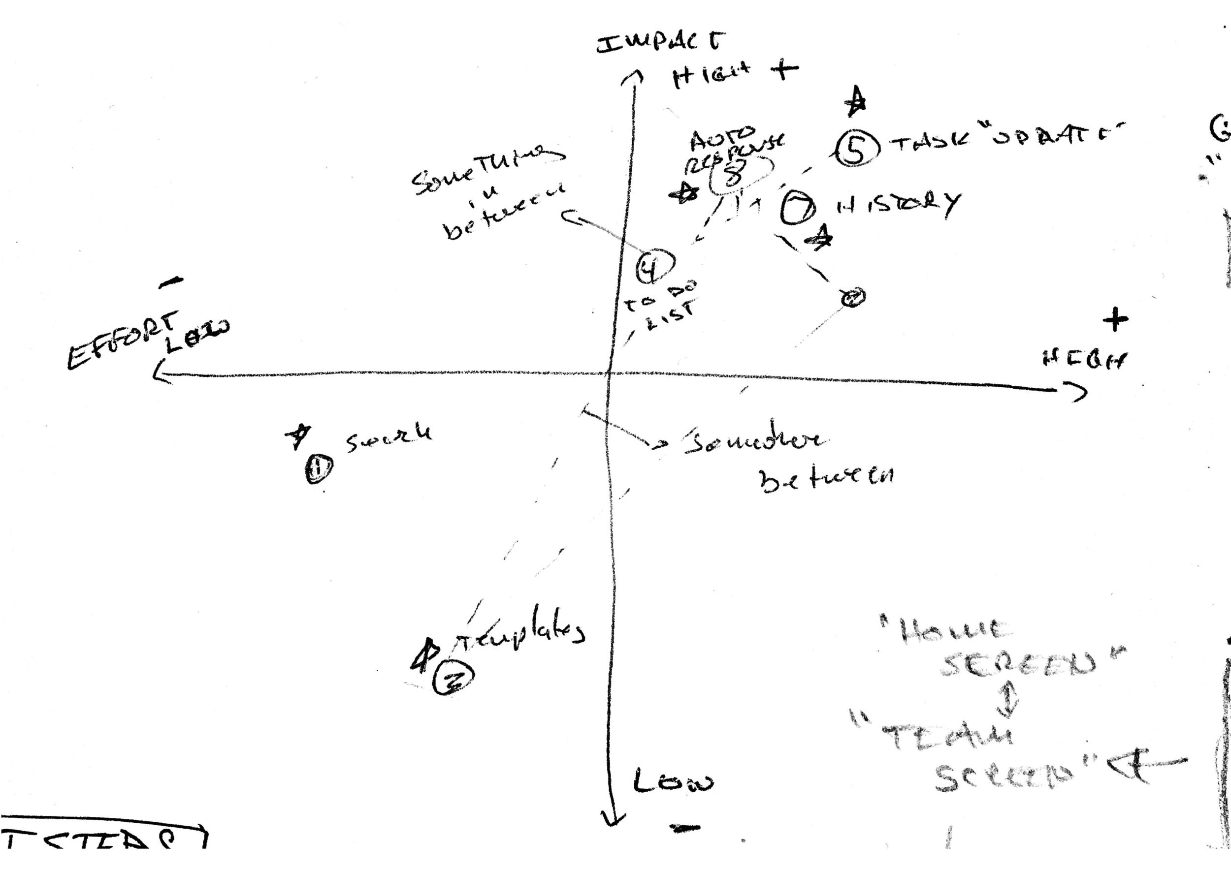
Once I had the list of potential features, I prioritized which ones were going to be included using viable vs. impact axis analysis.
By arranging them on this scale, I could see that some features being too large in scope and some having camparitivly less impact.
This lead to the best possible solutions not being one or another, but finding a "sweet spot" between the two where I think a feature could exist that solves the users problems while staying grounded in what could realistically be accomplished with the given resources.
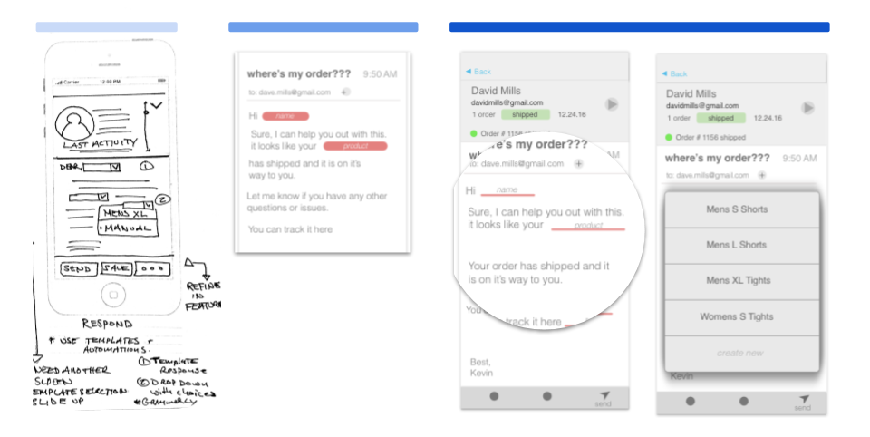
Features as Screens
After some features or ideas started to form, I began to do some initial sketches of how they would look as mobile screens. This gave a chance to do a very low investment prototype to explore such things as screen real estate and a very early sense of how things would work together.
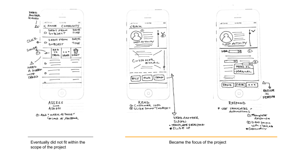
Within the scope of the project it became clear that I could make the most impact in two areas: the reading and responding of an email. I would have to leave the assessment of the core experience for later.
Design and Prototyping
The next steps cover from rough pen and paper sketch to Sketch application mock ups to prototyping using Invision. Along the way there were at least two rounds of usability testing as well as feedback and input from fellow peers.
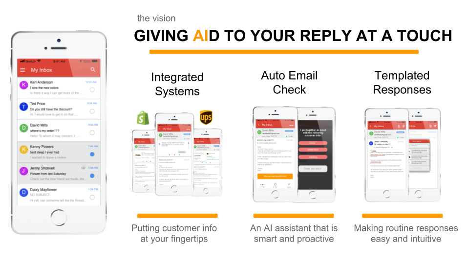
Integrated Systems
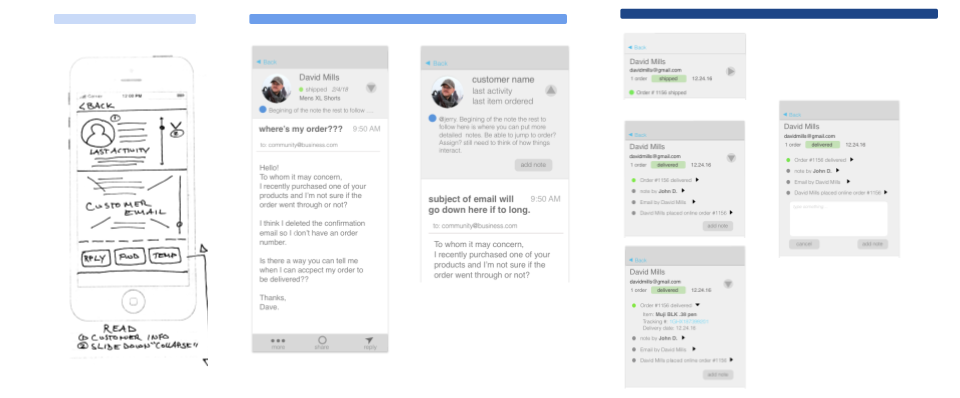
Working from a mobile system can be a big disadvantage to the user when they need to switch between multiple systems to answer one email. The goal was to give the user the most information about the customer that would be relevant while keeping screen real estate a priority.
My initial design solution was to only give the user the top “relevant” information. In interpreted this as the last action the customer took.
After some initial testing, I could tell users were looking for more or were still unclear as to how much information they would need to complete the next step in answering the customers query.
For my next iteration I tried to incorporate as much info as possible that would be relevant to the user. This included the customers order history, shipping status, updates, etc.
When testing I found that this became information overload. The drop downs had too much info at once and caused a sort of analysis paralysis with the user. It also quickly took up too much screen real estate with the multitude of drop down menus to handle on a mobile device.
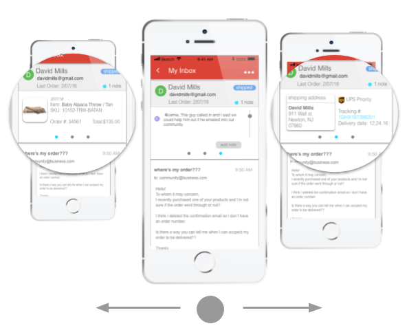
Solution
The solution I landed on came about after thinking about how the user usually deals with this problem. To answer a single email, the user often is dependent on information from multiple applications to answer a single message. This results in multiple tabs being open at once which is "ok" for desktop, but is not optimal for mobile.
I decided to take that experience and replicate it on the small screen in the form of “tabs” that the user could scroll or swipe between. By using a "Swipe" feature, I could both keep information clear while also saving on screen real estate space.
Email Check Assistant
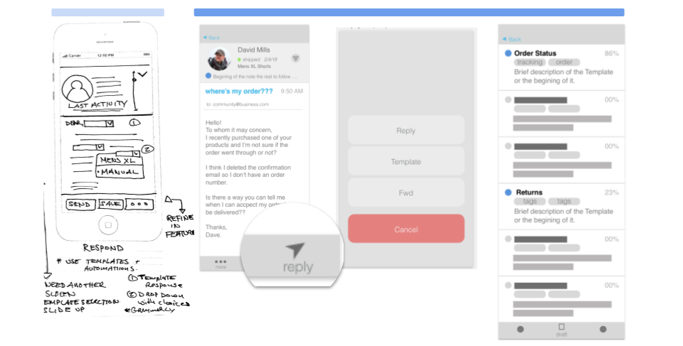
The goal was to design a feature that would help the user assess an email quickly and give the best possible solutions for how to move forward.
My initial thoughts were to have the templated response feature come up after the user selected to reply to the customer message. It was my initial thought that a template would be under reply (in terms of IA).
I also placed the template selection in another screen after the user made the choice to use a templated response. These responses would be organized by how relevant they would be to the email in question.
What I learned after testing was simply burying the template selection after the reply, there was not enough affordance to tell the user that they would be taken care of in the next step.
In reality I was just burying the solution and creating a longer user journey that did not add clarity or ease to the experience. In short, there were just too many steps.
Solution
To address this issue, I decided to move the process up in the user journey and gave it a higher affordance. Instead of just being options, I gave the messaging a more human voice so the user was more assured of what they could expect.
Now the user is directly told that the application can work for the email in question and will even give the top suggestions up front instead of burying them in behind two more screens.
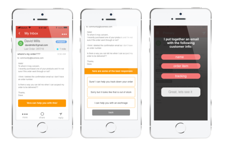
Templated Responses
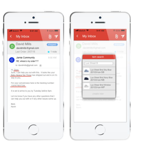
The goal was to give users are ready made email, but give them enough freedom to still feel in control and be able to make changes. Be able to give users the ability to pull in pre generated templates to cut out some of the more repetitive parts of email response.
My initial thought was that after a template was selected, an email would be generated with several key fields that the user could alter with appropriate values. All they would have to do is click in the field, and fill in the appropriate response from a drop down menu with relevant items.
It became clear that it was redundant to have users select from a field of options when there was ultimately little choice as to what would be filled in. If my app could pull in what the correct response should be, why am I making my user do more work?
What I also learned after some testing was users were not making the connection that this was something to be interacted with. My visual design was not conveying that this was something that needed to be attended to.
solution
After seeing slowdowns in testing at this stage I decided to start the user again with a pre generated email message, but now the fields would already be filled in with the appropriate responses as pulled in from the customer info.
If the the user did decide to change a field, they could do so by the same method of clicking on the field, but now they would not only have a drop down, but also a search field to perform an item look up.
To prevent error, there was also an added confirmation screen if a blank is detected in one of the fields, asking if there are sure they would like to send.
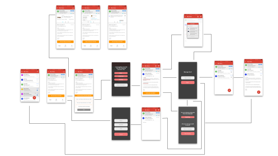
Putting it Together
user flow

wireframes
Hi Fi Prototype
Using Invision I was able to develop a prototype
See if you can answer David Mills inquiry
Closing
At the end of the 10 week timeline I was able to present a working prototype that was backed up by user research and usability testing. I believe a lot of progress was made in terms of identifying pain point and getting a start on what a working solution would be, but there is still more testing to do to refine those solutions and features.
next steps
As mentioned above I would like to go back to usability testing with the current most recent set of features to refine them even more. A lot of this project was finding and building features from the ground up. Next I would like to really dig in and optimize those features.
A bigger logical next step would be to develop this for a desktop application. While a good amount of the core solutions would remain, there would be much more work to be done in terms of design and usability.
Lessons
An important takeaway that came from this project was one from the user research phase. During my interviewing process, I noticed that it was hard to find interviewees that matched my target audience as much as I would like. In the future I would be more strict about getting users and subject more inline with the projects outset audience to have more focused findings.
Also this process taught me to attempt to be a bit more focused in my scope earlier on. Initially I had incorporated too many pain points and was thinking too broadly about solutions that I found out would have to be set aside for the future.